The fabulous world of wine labels
The true face of wine: On the one hand, the label on a wine bottle serves as the winemaker's business card; on the other hand, it provides information about essential components such as variety and age.
Some labels have long been legendary and easily recognised even from a distance, very many others are rather average. And only a few of them are really famous - and are either simple or extravagant, modern or classic, or adorn themselves with the works of great artists. As you can see, the creative bandwidth is almost inexhaustible. This is fortunate, because never before in the history of viticulture has there been such a wide variety of products - and thus such a need for ever new presentations.
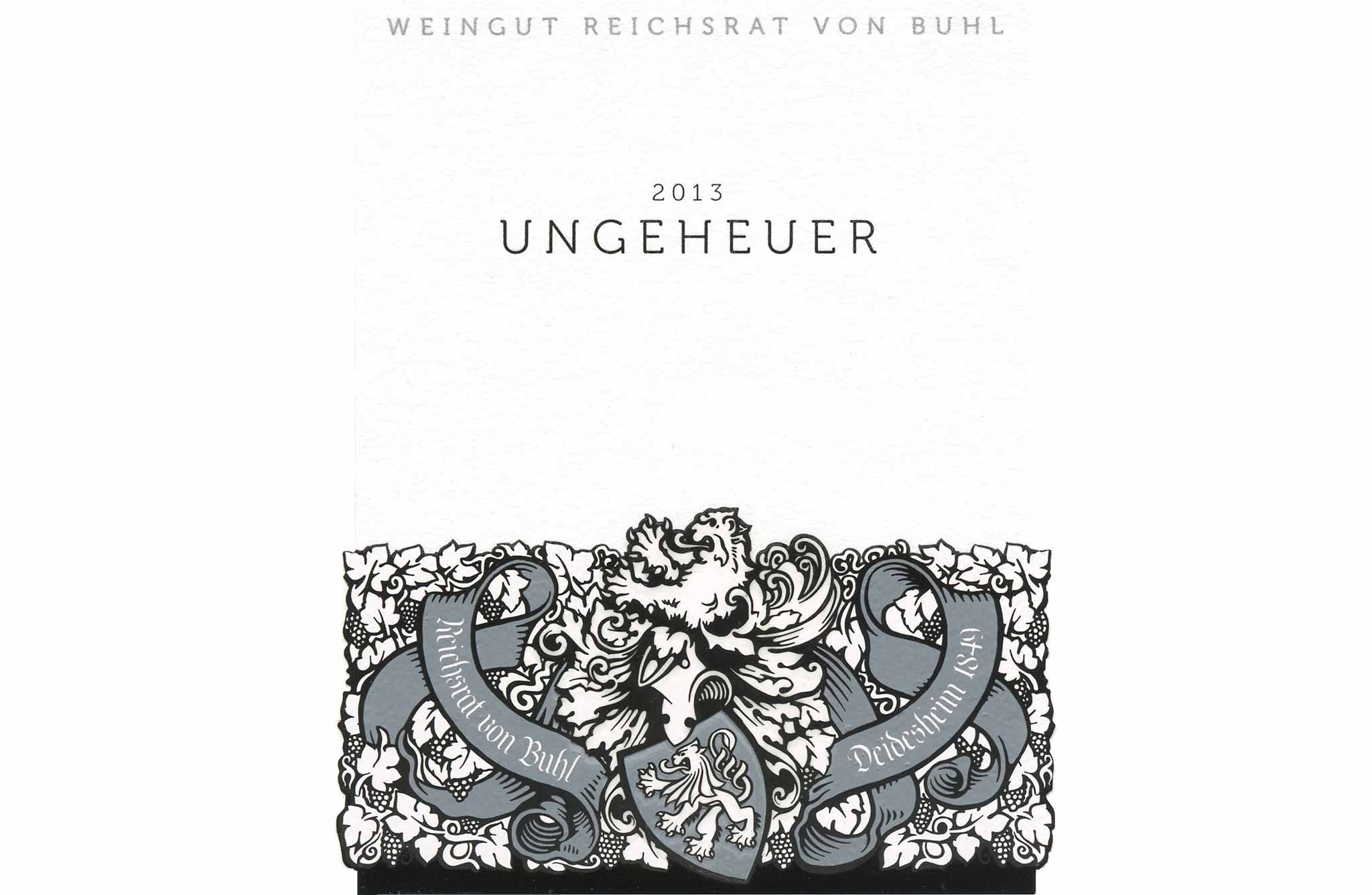
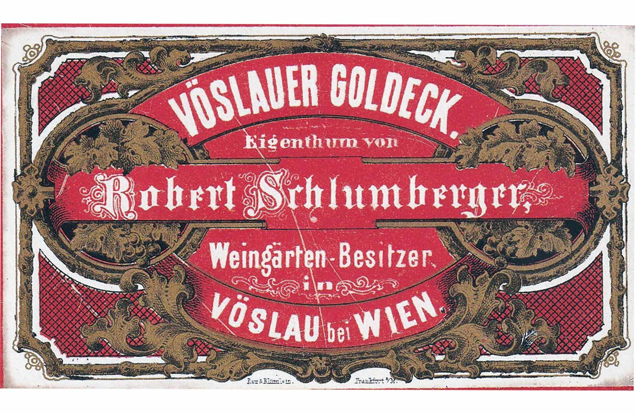
Until the 1980s the demand for wine labels was much lower, because apart from bottles for fine dining and the food trade, the majority of wine production was sold in litre and double-litre bottles or even in barrels. If a winemaker needed a label, sample catalogues from specialised printers were available, from which one could choose one's favourite and have one's individual details printed on it. Only a handful of wineries opted early on for individually designed labels and had their own brand visually polished up by a graphic designer or even an artist. And hardly any other label can point to such a long life as that of the Palatinate winery Reichsrat von Buhl from Deidesheim, and also the later Munich Secessionist Franz von Stuck, 133 years ago and still in use today - apart from a subtle facelift 13 years ago.

The visionary and the art
When Baron Philippe de Rothschild, at the tender age of 22, introduced the obligatory bottling of his wines directly at the château with the 1924 vintage, he had an "artist's label" made for Mouton-Rothschild for the first time. He hired the hottest Parisian Art Deco graphic talent of the time, 24-year-old Jean Carlu. When Rothschild returned to the estate after the end of World War II, he again celebrated this memorable vintage, which was outstanding in quality, by having a 26-year-old illustrator named Philippe Jullian from Bordeaux decorate the label with a V for Victory.
What followed was a legendary series of artist labels that includes illustrious names such as Henry Moore, Miró, Chagall, Braque, Picasso, Warhol, Francis Bacon, Dalí, Balthus, Lucian Freud, Jeff Koons, David Hockney and Keith Haring. In 2004, even Prince Charles was allowed to immortalise himself artistically on a Mouton label. It is certain that this move contributed enormously to the fame of the estate and was one of the building blocks for its sensational upgrade to Premier Grand Cru Classé in 1973. In a specially created museum at the Château in Pauillac, one has the opportunity to view the artwork on which the labels are based, as well as other designs.
Many wine producers, including very renowned but still little known winemakers, were inspired by this idea. But no one took the idea of marrying art and wine to such an extreme as the Austrian-born Californian star winemaker Manfred Krankl of the Sine Qua Non winery. Starting with the premiere vintage in 1994, Krankl developed a new design for each individual wine: the graphics for the label were created by the winemaker himself, and a new name for the wine and a different bottle shape make each cuvée a collector's item - not infrequently also awarded 100 Parker points.
What makes a label?
But what distinguishes a good wine label from an excellent one? The product designer Cordula Alessandri, who comes from Salzburg, has long been involved in the development of brand personalities; numerous wineries from Austria, France or Portugal owe their successful international appearance to her creativity. "Above all, a good label takes the wine seriously," Alessandri explains. "Like a sales pitch, it tells something about quality and tradition, the values of the winery and the winemaker. With a good label, you know your stuff: is the winemaker down-to-earth or does he strive for elegance, is he playful or is the wine the only thing that matters to him? The label is actually secondary, it's the inner values that count."
Alessandri's designs for clients such as the legendary Van der Niepoort winery or for Château de Roquefort in Provence show how she masters this challenge: "An excellent label not only tells about itself, but also involves the customer. Real communication is created here because both sides are actively involved," says the designer. "The wine lover feels understood, picked up in his world view and involved - and thus he becomes part of the brand." This is all the more important when the bottle is not in the producer's cellar, but on a sales shelf - surrounded by hundreds of others who have exactly the same goal. That bottle that the customer picks up and where he takes a closer look at what is actually written on it clearly shows what the difference is between good and excellent.
It is not only young companies that are faced at some point with the question of whether they should give their product a new outfit in a changed market environment, and what to look out for in a label. Design expert Alessandri: "The winemaker should first and foremost ask himself for whom he wants to make his wine - what kind of people are they, does he want to be friends with them?" Only when this has been clarified can one get started with the product design.
Ancient beginnings
Even in the early days of wine culture wineries were interested in the exact contents of containers filled with grape juice. In ancient times the Sumerians already used roller seals and stamps to mark clay vessels. The Egyptians specified the contents of wine containers more precisely, Greeks as well as Romans provided amphorae with information tags (lat. tessera) made of wood, ceramics or paper, by means of incised marks; even vintage and origin up to the vineyard location were noted beside the contents.
During the Middle Ages, people used methods similar to those used in ancient times to mark a special wine. It was not until the introduction of the glass bottle that handwritten notes also began to be affixed to these containers. However, the glass seal was initially used to identify the owner of a bottle rather than its contents.
Two conditions were decisive for the triumph of the wine label: the Introduction of the glass bottle as a standard container for wine - this happened from about the second quarter of the 17th century, when it became possible to produce them in large quantities and thus cheaply - and then the Development of lithography by Alois Senefelder in 1798. One driver for the spread of the successful combination of glass bottle and printed label was Champagne. For its worldwide distribution, no other means of transport could be considered than heavy glass bottles that could withstand the immense pressure.
Then, at the beginning of the 19th century, the trade in bottle-drawn wines also took off in German-speaking countries. In 1826, Alois Senefelder also invented multicolour printing, which was further developed into chromolithography by his student Engelmann in 1837. Today, the most modern and sophisticated printing techniques make everything possible that the winemaker's heart desires for his labels.
Safe as the franc
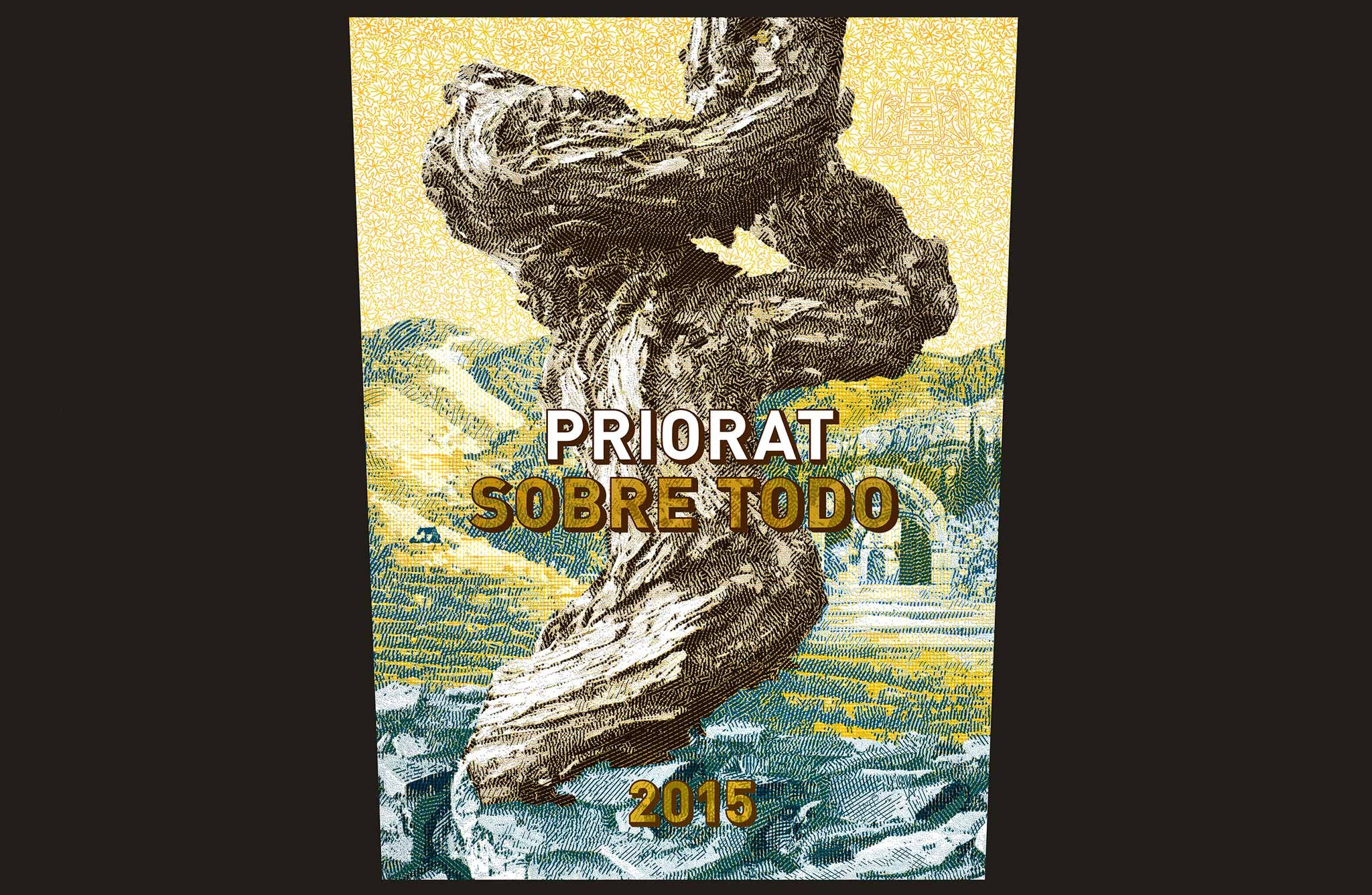
Swiss wine merchant Philipp Schwander, MW, exemplifies this aspiration with the label for the only wine from his winery, with the beautiful name "Sobre Todo", which means "above all". His idea: because he liked the last series of Swiss banknotes from 2016 so much, he hired the graphic designer of the same for his labels. The contact was made by the then chairman of the board of directors of Orell Füssli, the printing company responsible for producing the banknotes. Manuela Pfrunder, who happened to be a customer of Schwander's wine shop Selection Schwander herself, then travelled to Priorat several times for inspiration and even modelled an old vine. One can now also be found on the label engraved by Armin Waldhauser, Orell Füssli's banknote engraver. A unique project that took a total of two years to complete, it underscores the quality of Schwander's wines and makes them sought-after collector's items.
The art of etiquette
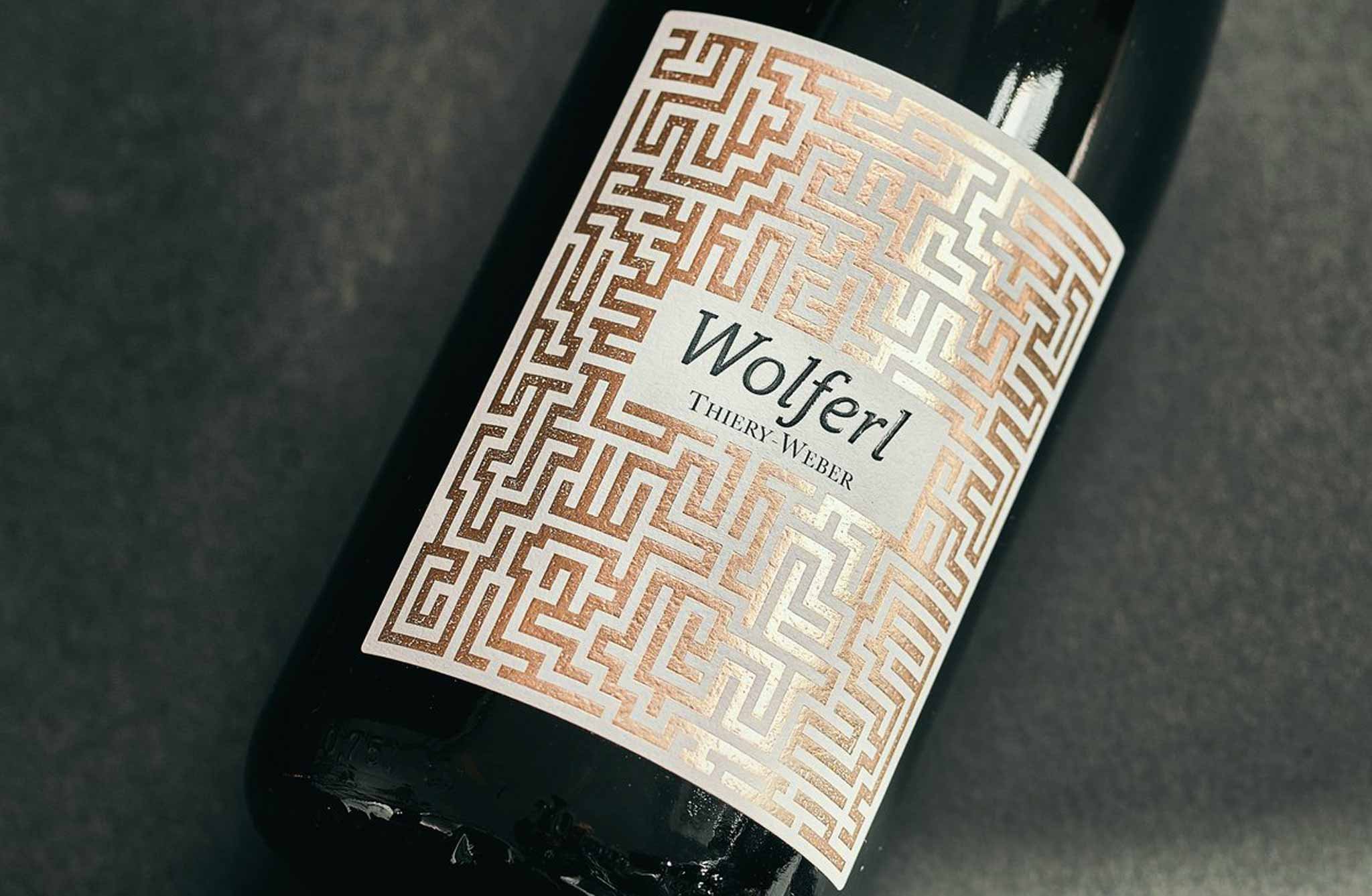
So we have learned that very often the overall appearance of a wine is decisive for a (first) purchase decision. Its visual appearance is conveyed by the bottle shape, which already suggests the origin, as well as the label, which is its business card and can say something about the claim of the winemaker. A perfect outfit, however, also requires a corresponding feel and places high demands on producers and graphic designers in terms of materials and technology. The range of options offered by highly specialised printers, from handmade paper to Braille, is now enormous and is constantly evolving with trend-setting innovations.
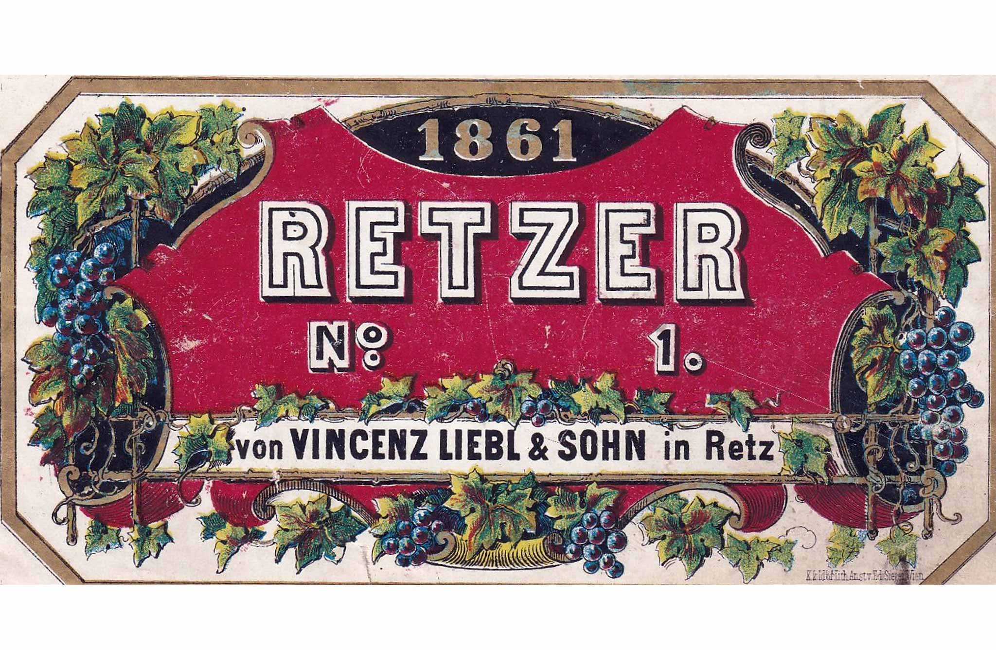
A brief review: in the middle of the 19th century there were hardly any suitable printing plants for wine labels in the K. u. k. Monarchy. The first labels were still produced by hand in Vienna by art lithographers in very small quantities. The reason for this was the low export volume of bottled Austrian wines. When Robert Schlumberger started his activities in this field around 1850, he still had his labels printed in Frankfurt. Austrian wine labels from the time before 1900 are therefore a sought-after rarity among collectors today. The most important litho studio for labels was that of Eduard Sieger, which was also allowed to use the court supplier title. While there were already hundreds of specialised printing companies in Germany, this special business developed only slowly in Austria.
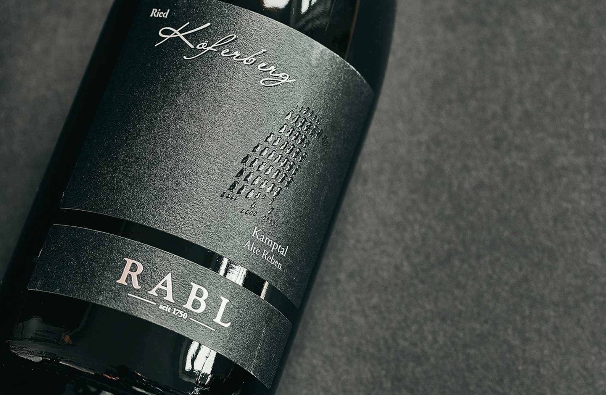
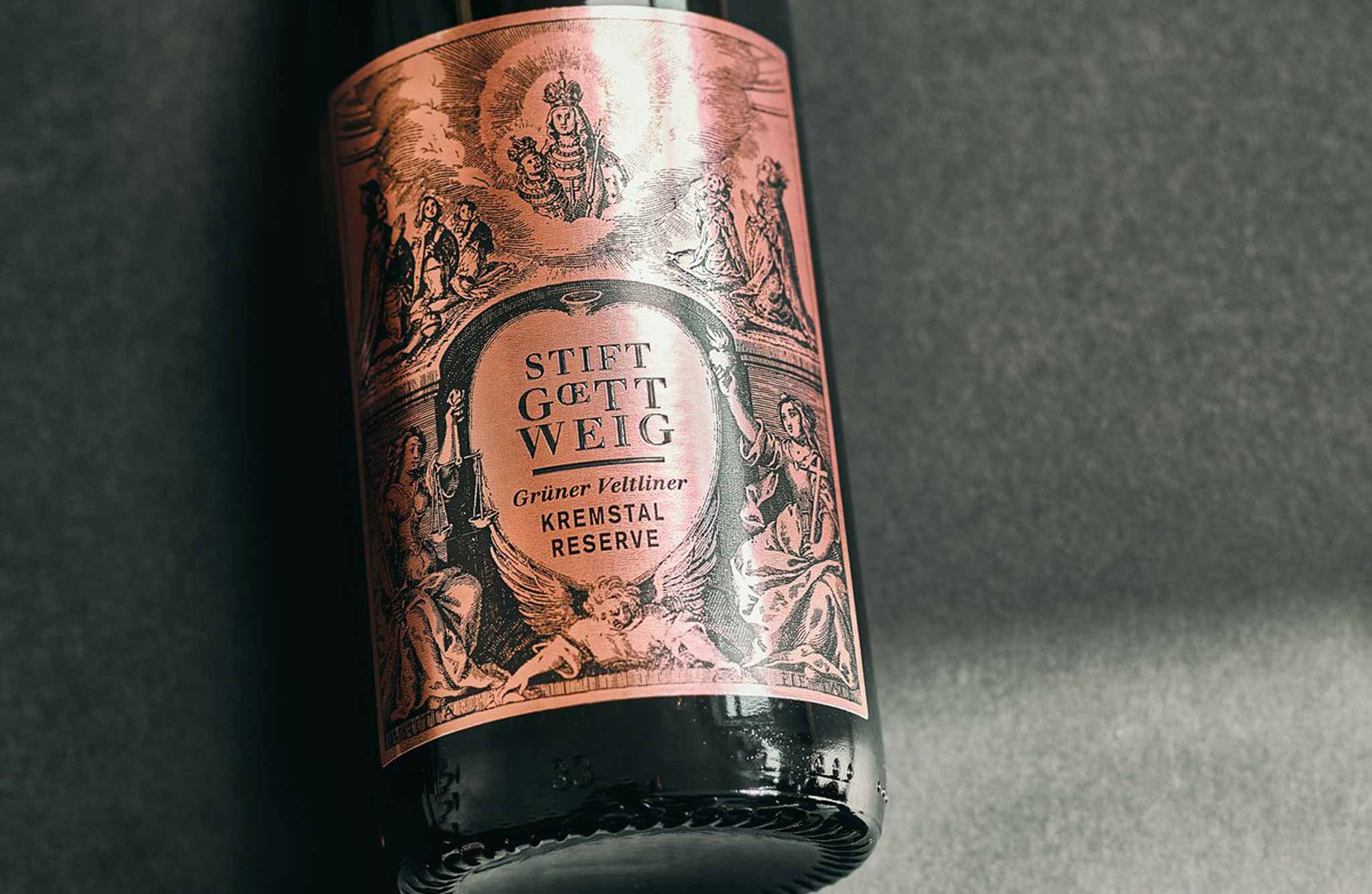
Today, state-of-the-art printing techniques determine the appearance of wine labels. Large-area or partial varnishing can be applied using screen varnish (for example, on the labels of the Rabl or Stift Göttweig wineries) or special metallic effects can be used to enhance the labels using hot foil stamping. So today, there are hardly any limits to the vintners' imagination when it comes to the technical implementation of their bottle design. Brave new wine world!